Saturday, June 15, 2019

Updating the Message of the Day (motd) on Raspberry Pi

I got a Raspberry Pi for my birthday last year, and this year I’ve been really playing with it.  I mostly got it to because I want an easy place to run my Node.js scripts, and spend more time learning a Linux environment.  I’ve really been enjoying having a Pi in the house to play with, but the most impressive thing to me is the uptime of having a system that does so little.  Today started with me wondering why on my MacBook I open the terminal and the uptime is already present, but when I log into my pi, the uptime needs to be typed.
 
It was time to change that.
 
I quickly discovered by Googling a bit that this welcome message was called “The Message of the Day”, or “motd” for short. The raspberry pi website has a great forum post about how to customize this to something that I really wanted. The post is “Custom MOTD - Message of the Day”. Look how nice this logon message is: 
 
rasplogin.jpg
 
 
However, by following the instructions on this page I had one major problem.  My colour scheme for my command prompt disappeared. Additionally yanewby posts that there may be a better place to have this run.  Well I found that and I wanted to post my findings.
 

How to update the message of the day

My Pi is also in a headless conifguration, meaning I just SSH into it to use it.  So there are a number of files that matter here.  I ended up not using the ~/.bash_profile which the user specified in his post.  Instead there are a few other files
  • /etc/motd - This is a static file that is displayed.  If you just want a static message, type it in here, and it’ll be posted every time you log in
  • /etc/update-motd.d - this is a folder full of scripts to be run
  • /var/run/motd.dynamic - this appears to be output of the last run of the above
In the /etc/update-motd.d folder, there are a number of executible files.  All of these are run as long as they are marked as executible.  I had one called `10-unamed`. The files run in alphabetical order, so if you added an `01-myScript` it would run before 10-unamed, and if it was `11-myScript` it would run after 10-unamed. I ended up backing up this file to my ~ directory, and editing it.
 
If you do make a new file, make sure you make it executable with the following command:
chmod +x filename
I had to edit some of the script from the original user to get what I wanted. My changes included:
  1. I had to specify which shell to run it with, so my first line is "#!/bin/bash"
  2. I also realized that the terminal hadn’t been set up for colour, so to get colour I had to add another line “export TERM=xterm-256color"
  3. The rest of the script was updated to
    1. Put a space between the hr’s, min’s, & sec’s of uptime.
    2. Change when the colours switched
    3. add my device name to the uname command
    4. Supply my actual disk to get the free space
    5. change the code to get my LAN ip address
    6. Change the code to get my local weather (I don’t live in the UK!)
You can see my code here:
#!/bin/bash
export TERM=xterm-256color
let upSeconds="$(/usr/bin/cut -d. -f1 /proc/uptime)" 
let secs=$((${upSeconds}%60))
let mins=$((${upSeconds}/60%60))
let hours=$((${upSeconds}/3600%24))
let days=$((${upSeconds}/86400))
UPTIME=`printf "%d days, %02dh %02dm %02ds" "$days" "$hours" "$mins" "$secs"`
 
# get the load averages read one five fifteen
rest < /proc/loadavg
 
echo "$(tput setaf 2)
    .~~. .~~.             $(tput sgr0)`date +"%A, %e %B %Y, %r"`$(tput setaf 2)
  '. \ ' ' / .'           $(tput sgr0)`uname -snrmo`$(tput setaf 1)
   .~ .~~~..~.
  : .~.'~'.~. :           $(tput sgr0)Uptime.............: ${UPTIME}$(tput setaf 1)
   ~ ( ) ( ) ~            $(tput sgr0)Memory.............: `cat /proc/meminfo | grep MemFree | awk {'print $2'}`kB (Free) / `cat /proc/meminfo | grep MemTotal | awk {'print $2'}`kB (Total)$(tput setaf 1)
( : '~'.~.'~' : )         $(tput sgr0)Load Averages......: ${one}, ${five}, ${fifteen} (1, 5, 15 min)$(tput setaf 1)
  ~ .~ ( ) ~. ~           $(tput sgr0)Running Processes..: `ps ax | wc -l | tr -d " "`$(tput setaf 1)
   ( : '~' : )            $(tput sgr0)Free Disk Space....: `df -Pk | grep -E '^/dev/root' | awk '{ print $4 }'`k (`df -Pk | grep -E '^/dev/root' | awk '{ print $5 }'` used) on /dev/root$(tput setaf 1)
   '~ .~~~. ~'            $(tput sgr0)IP Addresses.......: LAN: `/sbin/ifconfig eth0 | /bin/grep "inet " | awk '{ print $2 }'` WAN: `wget -q -O - http://icanhazip.com/ | tail`$(tput setaf 1)
       '~'                $(tput sgr0)Victoria weather...: `curl -s "http://rss.accuweather.com/rss/liveweather_rss.asp?metric=1&locCode=EN|CA|VICTORIA" | sed -n '/Currently:/ s/.*: \(.*\): \([0-9]*\)\([CF]\).*/\2°\3, \1/p'`
 
 That’s all there is to it. Make sure it’s executable, and now disconenct and reconnect and you should see your new message of the day. The above produces this:
 

Monday, May 02, 2016

Matching the UI to the User

I recently found an article called "Why I love ugly, messy interfaces - and you probably do too" by Jonas Downey, a designer at BaseCamp. I opened this up because I vehemently disagree. All user interfaces should be as beautiful as possible. In today's age, it's unacceptable to punt those P3 "fit and finish" bugs and ship something that looks ugly. It takes an extra week to delight your users? Do it!

At least that's what I had the mindset of going into this article. What I actually got out of it was exactly in line with my point of thinking, aside from loving ugly messy interfaces.

Matching the UI to the User ...

Old school usability study, behind the one-way mirror
Matching the UI to the user has never been more important. Recently, I was the product manager working on Notarize.com, a new product to enable American's to get documents Notarized in a digital fashion, without the beige carpeted walls of an antique Notary office (at least that's how the one looked like that I went to when I was desperate one day!).

Designing the interface involved designing for an end iPhone user who would likely use this app one or two times in their life, then designing a web interface for the Notary to use, who would likely notarize a document every 3-5 minutes in any given shift, and lastly, for the Administrator to manage notary's and review certain analytics.

On the iPhone, it was super critical to get trust, and friendliness across. This lead to working with the design team to create the simplest UI possible. Fancy animations, great illustrations, a flow that made sense. It also had to get the customer to vest by the time in app before it prompted for credit card and drivers license information (likely drop-off locations). Something that you could use once, or twice years later and still feel like an expert user. Being able to sign, or annotate the document just made sense, and the app helped you along the way.

On the web, we chose the "ugly, messy interface" approach. Ok, so it wasn't ugly at all, it was beautiful! It wasn't super simple however, it leveraged white space for "same page" content delivery. In every 3-5 minute call, the notary would have to review the drivers license, review and edit the document, maintain a video call, and charge the user. Having multiple pages and a simple design would only have lead to long-term frustration for the Notary user. Instead we focused the design on every click needed to perform an action: "add a signature", "add a date", "mark complete", "charge user", "Don't charge user", etc. In fact, we designed the system to just assume that the Notary wouldn't want to click much at all. The system automatically answers the next call in the queue, unless the Notary intentionally marks him or herself unavailable (everyone needs a lunch break!). The drivers license is visible, and directly below the video feed, so you can validate it without even clicking, tabbing, or hovering (but you can hover or click if you need more detail). I.e., the interface was optimized around speed, knowing that the notary would get some training, we optimized the UI for the expert.

The admin console was targeted at frequent tasks, reviewing analytics, and less frequent tasks, adding or removing notary agents who work at the company. As a business starting out, it's likely the owner would have that dashboard open much like a real-time dashboard for a rocket launch. We designed for this persona as well.

All this is to say, is that each part of your product, think of who will be using it, and what their needs are, and design for that. Jonas talks about the Craigslist UI, but users can find what they want, they don't have to search, it's look, and click, no searching or figuring out how to use the UI. He also talks about the Photoshop UI, again, can you imagine how much clicking it would be for a digital artist if this was a simple design?
On a last "devils advocate" note, working on Small Business Server 2008, we wanted to target the DIY or "Do-It-Yourselfer" as the system administrator, but also enable the paid consultant. More time was spent trying to figure out how to make the UI work for both audiences than I care to sum up. Looking at the product now, it just looks like it's for new administrators, missing both marks. There are very little DIY people administering the software, and most of the consultants use the standard server consoles. Ultimately, targeting two audiences just alienated both of them.

While Jonas hits a great point, it's not that we like ugly, messy interfaces, its that we like UI that's targeted to our use cases, but we want it to look beautiful, right Jonas?

How are people using your product?

Kudos to the MetaLab team who pulled this together, such a great team of designers, developers and QA. Learn about the Notarize product here - http://metalab.co/projects/notarize/ 

Wednesday, April 20, 2016

What Just Happened? Let's Talk Post-Mortems

Today one of my favourite "celebrity" Product Managers, Ken Norton, published a quick and dirty article on Bring the Donuts called Blameless Post Mortems. This spurred a thought process for me on the importance of review.

Review Meeting


There are two important times to look back, and the both have different ways of approaching them.

  1. When there was a clear service failure, it's important to figure out what happened, and how to prevent it from happening again.
  2. When finishing a long running (3-5 month) process or project,  extracting the learnings from that to apply to future projects.
In Ken's Post Mortem document, the former is what is discussed. When something break, it's important to conduct a review, in a blameless fashion, and figure out how to prevent it from happening again. 

Service Failure Post-mortems

Often when there is a service outage, a security hole or some notable problem in a service it's important to review in hopes of preventing it from happening again. With the right process in place, repeat outages can be prevented from happening again, although in some cases, the outage may not be preventable, or not immediately preventable (i.e it may take weeks or months to re-write part of a service to prevent it from happening again). However in many cases, simple process or diligence can increase service reliability. For example, code reviews with senior developers, or security audits with least privilege assigned to operational folks. 

Ken points to a template that Google uses for this purpose. This is essentially the same template that is used at Microsoft as well, so it's definitely a good source. The idea of the template is to just work in a group of experts on the specific issue to fill out the template, track the bugs found through closure (code fixes, or process fixes), and share the knowledge with everyone on the team to ensure it doesn't happen again. Then move on and learn from that experience to the next outage, rinse and repeat.

Shipping Post-mortems

The second type of post mortem usually happens at the end of shipping something substantial, or if it's continuously shipping, they can be done every 3-6 months. It makes sense to run to connect a post mortem to something substantial: i.e. a new multi-sprint feature out the door, a retrospective of trying out a new tool, or a 3-5 month anniversary of a team being together are good examples. Preferably the retrospective is not too far away from the start of the project, that the project starting bumps can still be remembered, and not too close that the team hasn't hit cadence or shipped something.

This critical post mortem helps discover what's working for a team, or where a product manager and/or leadership should focus energy on change.

Retrospective
Sticky Notes are your Friend
This type of post mortem is run differently than a service outage, and likely will take up more time to complete. A good rule of thumb is the moderator, often a product or project manager, should put aside about one and a half to two hours of time, while the rest of the team can join for an hour plus brainstorming. Here is how to run this type of post mortem:

Preparation

Brainstorming takes time, for some it takes a short time, and for others it takes a longer time. For maximum meeting efficiency, it's best not to do this in the post mortem meeting. When the 1-hour long post mortem time is published, the moderator should ensure each person attending comes up with 1-3 things that went well, and 1-3 things that could be improved, and if possible a suggestion or two on how to improve each. Brainstorming should be completed before the meeting starts to make the meeting as efficient as possible.

Execution of the Post Mortem

The execution is where sticky notes are excellent. Most of the meeting will be run by moving sticky notes around, grouping them and positioning them in priority order. In a worst case or a remote case, a whiteboard works as well (i.e. remotely accessible meetings can be run by screen sharing using a digital whiteboard or a shared GDoc/Evernote file. It's probably most efficient to have a typist who is separate from the moderator). 

Here is the suggested timeline of the meeting:
  • 5 mins - Introduction and adding prepared 1-3 pros and cons to separate sticky notes
  • 10 mins - Team sorting of all the sticky notes on a wall/whiteboard and grouping similar items together, prioritizing the team top 1-3 pros and cons
  • 15 mins - Discuss what went well (the pros), and why we should continue doing those top 1-3 items as agreed by the team
  • 30 mins - Discuss the top 1-3 items that could have gone better, what can be done to address them, assign action items to people to track resolution
Let's break each of those timeline items down:

The first 5 minutes of the meeting is just paperwork. Members write down their top 1-3 areas that went well and top 1-3 areas for improvement, each on it's own sticky note, no need to write own how to improve these at this time. Each member of the team now has 6 sticky notes. In some cases, members come with more or less, you can choose to include them or not, it just makes for more paper and longer discussions. What has worked well is to really focus on the team top 1-3 items for this post mortem, then at a future post mortem (3-5 months down the road), tackle the next level. This is a reasonable amount of change for the team to handle in that period of time.

The next 10 minutes of the meeting is about review. Each team member reads out and hands their stickies to the moderator. The moderator is responsible for grouping them together, stack ranking and ultimately by the end of the 10 minutes, the group collectively has the top most agreed upon "team" top 1-3 things that went well, and the "team" top 1-3 things that need improvement. 15 minutes has passed and we're now set up for success for the rest of the meeting. This process ultimately leaves a handful of things to take note of, but aren't considered for active change as outcome of this meeting.

The next 15 minutes are focused on the things that went well, or the successes in the project. While everyone likes to celebrate successes, it's ultimately done to ensure that when we are correcting for what didn't go well, we don't lose site of the things that actually made this project great! They are captured for historical purposes as well. Was the communication tool the best part of the project? Was a process for less than 2 hours for code reviews beneficial to the speed the team ran at? Was having a spec-let a good thing? Let's do the good things again. This section may even be less time, which is great, because the heart of the meeting is next.

The final 30 minutes of time are focused on the top issues that need addressing, this is the meat of the discussion. The team collectively looks at the "team" top 1-3 and actively discusses ways to improve during the next project. Items like "The bug tracking software was a bear to work with!" might result in a project manager assigned to review and recommended new software packages to track bugs. Another example might be, "Our communication software lost track of the decisions we made, forcing us to re-make decisions a month later", might result in a process to document decisions outside of chat tools once they are made. Lots of good ideas will come out from people who didn't even have this as an issue, which is why it's optional for the person suggesting the area for improvement to actually come up with a solution. Coming up with the solution is a team effort.

Lastly, as part of that last 30 minutes, it's likely that most if not all of the key items cannot be finalized in the 1 hour meeting. It's irrational to think you can pick a new bug tracking software in this 30 minutes for example. As such for each change we need to assign a BOL (aka a Butt On the Line) to drive that issue to closure. That person owns the research, delivery and communication of status of that. Depending on the organization, that BOL may have the authority to make a change, or simply just make a recommendation, either way, communication is warranted.

When the execution phase is wrapping up, the moderator will want to capture the notes, either a photo of the sticky notes, or a good note takers notes are fine.

Follow-up

After the post mortem is done, the information needs to be shared, a good moderator will take the notes of the top 1-3 items that went well, and the top 1-3 items that need improvement and write up notes on how the improvements are planned to be implemented and who the BOL is. As the BOLs get resolution, they can even follow-up to the original communication with the changes. The format of the notes should be titled with the project, have the date range that it covered and who attended the meeting. Then jump into what went well, and then what could have gone better, and how the team suggests to improve it, with the BOLs assigned to each item. 

Keeping the notes as short and crisp as possible is important, since the moderator should share the learnings outside of the immediate team in places such as a company Wiki, a broader email to a group of leads or in a specific chat tool. The key is to match how information is spread at the company.

---

This post mortem method really helps the team celebrate wins of working together as team, as well as helps the team focus on improving together, where everyone has a voice. It's also a great indicator for the leadership team on the health of the core of their business and where leadership should spend effort. Effort might include replacing core technologies if they aren't working, or finding key talent to improve knowledge or just ensure their team is staffed appropriately.

As a parting note, while it seems there is a lot of effort that goes into a post mortem, it's important to learn from mistakes and from successes and not repeat them. The hour or two invested here often save hours in the next project, and potentially retain your talent. Frustrated talent looks for less frustrating circumstances.

Tuesday, March 29, 2016

Product Managers Should Know Their Customers - No Excuses

Product Management is usually a role that is customized to the organization in which it exists. As such it's extremely hard to explain a product managers role. I usually share this link to friends and family who ask the famous "so you're 'in computers', what do you do?" it's written by Martin Eriksson. Here is the simple version of you as a product manager:

Product Management

That's right, the pinnacle point of the cluster f--k.

Many people read this diagram as the product manager being involved in the decisions as it relates to UX, the tech decisions, and where the business is going. While this is very true, a product manager is also a supportive role. What that means is the designers, developers and business leaders will have questions, a lot of questions, and it's the product manager's job to answer them or find an answer, somewhere. 

Finding that answer may come from inside the company, but as a company grows, it'll be harder and harder to find the right person, or worse, answers may differ between different business leaders. Having multiple opinions will create a broken user experience in the product. The product manager normalizes the feedback, collects more, and combines it with long term direction creating a cohesive story for end-users using a product.

So if not all the answers come from inside the company, where do they come from?

Customers, Customers, Customers.

A product manager should know exactly what their customers want, at all times, about each key feature in their ownership. There is no excuse, except perhaps for initial for ramp-up periods. A product manager brings the voice of the customer to the table. It doesn't matter if the product is supposed to make millions (a.k.a. "Business"), it looks beautiful (a.k.a. "Design"), or is a masterful architecture of tech-greatness (a.k.a. "Tech"). If it's not targeted towards a market and a set of customers, it'll end up in the bit bucket.

So a product manager needs to know their customers, deeply. How is this accomplished? Research, and lots of it. I particularly like this article about the breakdown of Qualitative and Quantitative research, to help you once you get the data. I like to get my data from many different sources, here are the top methods for getting data, in order of most often used:
  1. Telemetry - Data-mine the heck out of the product as it provides daily insights! What are customers using,? What are they not using? How long is it taking customers to go down a funnel? Where are the drop off points? What does A/B testing tell you?
  2. Support - Current customers are calling to tell you what's broken, what they want, what they need. Pick up a phone and listen. Follow up with some of the more interesting ones that align with business the business direction.
  3. Sales - Potential customers are on the phone as well, what do they want? Why didn't they choose your product? Why did they? What would make it a slam dunk for them next time around? What competitors are they considering and why?
  4. Round Tables/Advisory boards - Get your key customers in a room together, or on a webinar and let them voice their favourite features (don't mess with this, or improve incrementally for low-hanging fruit), and their feature wishes and hated features. Let them talk to each other as well.
  5. Conferences - Not yet potential customers who could be potential customers, who may have never heard about the product or company. Get their reactions, what do they like, what don't they like. Are they extra engaged on key features, do they call out features that should be there? And my favourite, let your customers sell other potential customers on the product and see what they think are the key features.
  6. Site visits - Just like a lion safari, watching the users in their natural habitat is irreplaceable. Watch where they get tripped up, ask them why they chose one way over another way. There is a lot to learn. The caution on this one is to make sure you do multiple site visits so there isn't an overly tailored and specific request for one customer, geographic or vertical.
  7. Calling or E-mailing - Calling works better than email (less noise these days), but simply calling a customer with a question or two, and potentially a perk to get their attention (1 month free for example). A ton of insight can be gained by talking directly to a customer.
  8. User Studies - These are expensive, but super informative to study behaviour. It's like bulk sight visits sitting behind one-way glass. You often need a person or company to find and orchestrate the study on behalf of your company. If you do this, attend a number of sessions, it's completely eye-opening.
There are many ways to connect to customers, these are my favourite eight. The absolutely key thing in all of these is to listen, and then listen some more. Then take notes before the memory fades.

Lastly, once the customer is understood, to help other disciplines understand the customer, it's not a bad idea to put together a single page for the persona(s). This single page is an "average" customer that takes the 100s or 1000s of customers met, and makes up about 80% of their needs, wishes, and thoughts. 

I like to print these out on a piece of paper and stick them up around the office. They have a "fake" name and picture, details about what they do and care about, enough to get the other disciplines aware of who they are building for. The plus is if an engineer needs to make a snap decision while the product manager is at a conference or site visit, they can do just that and get it 80% correct!

Got a suggestion on how you like to connect to customers? Drop it below.

Thursday, March 03, 2016

When Should a CEO Hire a Product Manager?

A company usually starts with an idea, or a couple of people getting together over an idea. That idea percolates and becomes the center of attention for the founder(s) or CEO. Obsession over details and getting things just right is the norm. This is all goodness. Hopefully that obsessive effort takes off and the CEO is forced into running a business, instead of nursing an ember of an idea.

I have never been a CEO of a company, but I've watched them. The responsibilities seem endless. Build the right team, which means hiring and interviewing. Keep the VCs happy, which means flights and travel and presentation prep. Go find the customers and evangelize, more travel and more presentations. Make sure the company can make payroll, reviewing the finances and financial planning. Prioritizing the companies limited resources to get the biggest bang for a buck. There is a lot more than that, but even those alone seem like full time jobs. Some of this is easier if there are co-founders and division of duties is forged. But often co-founders have the same vested interest in knowing all the details of the business, and thus never fully leave the other to handle their tasks without at least being in the know.

All this, then a developer wants to know what should happen if a user taps the help button. The product needs help, but who's going to write all that content and figure out the user flow back into the app?


The CEO's job is to focus on the big picture, the big moving parts and the future of the company and product. You've heard the phrase "Hire to your weaknesses", but the CEO often doesn't accept that a lack of time is his or her weakness. Or often feels that since the idea was theirs, no one else will understand it. Building a software product and worrying about the details takes time, and lots of it. It's not accepted today to ship something where the details aren't thought out, a single bump in the user experience can cause 1,000s of users to jump to your nearest competitor. Moreover, that bump is what they remember about your product, it'll take a lot of work to convince them to come back as they think of your product as unpolished.

The CEO needs help, but how do you know when? Here are some signs a CEO should look to getting a product manager as soon as possible to help build your product:

  1. You find features in your product that you had no idea were even in planning
  2. You haven't used your own product in the last 2 or 3 releases
  3. When you do make it into the office, there is a line developers outside your office waiting for you to make a business decision for your product
  4. Each email you get from internal employees starts with "Sorry to bother you again, but ... "
  5. You feel the momentum of development has slowed down, and developers don't have butts in seats coding up a storm
  6. You find a product request from an important client that's three weeks old and you haven't mentioned it to the team yet
  7. Your development team is telling you which features they want in the product and most of them are over half completed
In many of the above examples, the development team is missing the product direction, the answers to what's next, or what business decision happens at this stage of the user experience. The day-to-day of product management!

One thing I've learned about developers, is they like to code. If there is nothing to code, they will make something up to code. This doesn't help the company, and it doesn't help the end user. My worst nightmares are when developers don't have customer features to build, so they wish to re-architecture the product. While a refactor is necessary from time to time (future post on this topic), it's a lot of development and engineering with very little end value for the end user.

Without product direction the direction of the product turns from a targeted, to shotgun approach. The long term vision of the product that customers can visualize disappears. You end up with a lot of features that are indeed nice to have, but don't add a lot of value to the end user. Such as:
  1. A forever changing foundation of the app or service bent to whichever developer has the more convincing argument at the time
  2. A set of unpolished quasi features that loosely fit together, instead of a cohesive vision of intended value
  3. Broken flows across pillars in your organization (aka, the org chart is showing) making users stumble around inside the product
  4. A lack of investment in larger customer requests
  5. Slick animations in areas of the product that are rarely used
... to state a few.

When a CEO finds themselves too busy to keep the product moving along at an acceptable pace, with features directly targeted to the customer, it's time to think about a product management role. Essentially, as soon as the CEO can't spend more than 50% of their time worrying about product direction.

Find a product manager who shares the vision of the product, and spend a lot of time with them. Initially, a huge amount of time. Let them play with the product, then spend more time with them. Lastly, bestow them on your dev team and watch the magic unfold. The CEO will walk away with more time, and a better product as a result.

Once hired, it's important to keep the Product Manager and CEO in sync at a minimum on a weekly basis. I could write more on that, But The PM Mind Meld by Ken Norton tackles exactly that.


Tuesday, February 23, 2016

Why Product Management Should be a Separate Person or Team

I've seen lots of teams and companies try to overload the product management role onto other disciplines. Often the CEO, CTO or a set of developers, or in best case, designers take it on. The problem with doing this is conflicting interests.


The CEO is interested in bringing his or her vision to life, yes, but often doesn't have time to deeply understand the customer, aside from themselves. This often results in a product that serves one person, or a set of people that are almost identical to the CEO in desires. With so many other demands on the CEO such as sales, evangelism, team building, financial analysis, and market analysis, the CEO can't do it all. This leads to developers coding ahead of the CEO and eventually into developer driven design. While it's great to have input from the CEO, product management should quickly be handed off to a dedicated resource.

Technical roles such as developers or CTOs often want to take on the product management role, or often surge forward when the CEO is busy with their own ideas. They are focused on the technical debt and technical challenges they see. This will no doubt increase the value of the product, but usually not in ways customers see it. Customers don't see changes in framework, or how quick your continuous integration is, or updated support tools. Developers often direct products again in the ways of cool tech to work on, or hard technical challenges, without actually understanding what impact those parts of the product will have on the customer. In many cases, such as a changed out framework, there is no impact to the customer, and months pass without bringing value to the people who are paying.

The closest role that can help shape the product is a pure Designer; more so if that Designer is product minded. Designers bring a lot to the table regarding ease of use and aesthetics of the product. However, they tend to focus on design principles and solving the problems at hand. Designers are fantastic for taking part(s) of a long term vision and executing on the near term, but many designers won't think about the long term goals and product strategy. They focus in the weeds of what's in the next release, does this have to be a text box, or a drop down, and where does it go? While design execution is extremely important, it doesn't satisfy the need for a cohesive long-term strategy for the product.

The product manager role, separated from other disciplines, enables a long term plan by defining a story. Product management also brings the customer voice to the table, it leverages customer feedback, and other information to build a product road map, and product goals. Product management focuses designers and accelerates developers on what's important now, what to plan for in the near term, and what to account for in the long term. Product management also has the ear to the ground for changing market conditions, and can help adjust the plan when the long term market is adjusting.

Input from the CEO, developers, designers and the rest of the company is still important, but a single person to own the strategy and vision will build a cohesive product and ultimately save time, and delight customers with a plan in the long run.


My favourite example of engineering run design is Windows Update from Microsoft. Albeit Windows is a large platform, and there is a strong desire to both keep Windows secure, while at the same time make it easier to maintain, there is a clear missing voice of Product Management.


I can tell this is engineer driven because the easy engineering road is taken, and it's irritating to customers. While the concept of "Patch Tuesday" was defined around this made it easier for system admins to plan for patch updates, it's terrible to think that this concept even has to exist. The personal computer should be doing whatever it can to make the person successful. The person shouldn't have to wait on maintenance, or updates when they want to use their computer, those should happen in the time the person isn't around. I mean humans do sleep for 6+ hours a night, more than enough time for computers to maintain themselves.

The reason that a reboot is intrusive is because no one or no team at Microsoft has taken the effort to figure out dependancies between components, as such when taking down a small service to update it. The teams at Microsoft have no idea what they might be breaking in other teams services, so they reboot the computer, a.k.a the easy path. Then once they know things are patched, they start all the services, when in reality, it should be something that the computer can just save the users state, restart a small service, set of dependant services or apps, and be invisible to the end user. If there was serious Product Management on Windows Update, and in the case of large enterprises, that Product Management team had executive support (aka, Satya or EVP of Windows, Terry Myerson), things will change for the better for the end user, to the tune of "Wow, my Windows computer never reboots!"

Thursday, April 09, 2015

Constant 50% CPU usage on iPhone running iOS8

I don't usually publish break/fix stuff here, but I couldn't find ANYTHING on the Internet that helped me solve this one, and I think I've nailed it.  So here goes.

I have an iPhone 6 running iOS 8.x, I am on the Rogers network in Canada.  I was travelling in the US on the AT&T network, and got a carrier update which I mistakenly applied (although all my support calls indicated that this shouldn't affect anything).  Upon returning to Canada, I discovered my CPU usage was bouncing between 50-51% as a flat bar (Discovered using SysStatLite).  Anyone who knows anything about CPU graphs and computers know that when a computer is idle, the CPU bounces between 2-8%, but when it's doing stuff, the CPU graph bounces randomly all over the place, unless the CPU is pegged at 100% doing some processing (photo editing, video editing, video gaming, etc)

Idle CPU Example


As you can imagine, the two biggest battery eaters on a mobile device is the CPU and Screen, followed closely by network).  So with my CPU hovering at 50%, my battery life was cut in half.  an hour drive home would eat 1/4 of my battery, so that's like 4-5 hours of battery life in my phone, not acceptable!

So let's get into the list of things I tried without getting intrusive:

  • Rebooting
  • Closing all open applications (double-tap home screen and close apps)
  • Turning off all background apps
  • Turning off all location services
  • Going into Airplane mode
  • Restoring from iCloud
Whoa! Going into Airplane mode killed the CPU instantly, that's a good sign.  In fact, turning airplane mode back off, then left my CPU normal... but only for 30-60 minutes, then back to 50%!

50% CPU, airplane mode to 8%, off airplane mode spike and back to 8%
As you can probably guess, I don't just feel my phone in my pocket getting warm and immediately open it, turn on airplane mode, and then turn it off and stick it back in my pocket, so I would often pull it out of my pocket and think "damn, my phone is hot", and I have 30% battery left.

Time to call support

I called Apple.  Apple support is A-Mazing if you have never called it.  We did a number of things
  • Back-up the phone and Restore it from iCloud (and also from iTunes), again
  • Factory reset the phone (no issues, but no data)
  • Set up the phone from scratch again (without using a backup, by the way this is extremely intrusive and painful!)
All these problems still persisted.  Apple replaced my phone.

THE PROBLEM STILL EXISTED!!

I went to Rogers support, they replaced my SIM, so now I have a new phone, new data, and new SIM and the problem still existed.  Clearly since this isn't wide-spread on the Internet it was something I was doing.  I started researching everything that I could find (apps would crash as seen in SysStatLite) and I would research them
Still nothing seemed to drop the CPU instantly, until I came across this community article.
Answer #3 on this page indicated that if you sync'd your phone against an Exchange server, contacts would have issues now and then.

This made something click for me.  As a former Microsoft employee, I'm pretty knowledgable on Exchange (after my years working on Small Business Server).  I knew that Outlook.com supported Exchange Active Sync which is a fantastic protocol for syncing email, usually reserved for full Exchange (Office365).  Instead of setting up my iPhone using the default Outlook.com settings, I chose to set up Outlook.com as an exchange server.  I deleted my personal email account and re-set it up using the prescribed method for syncing Outlook.com addresses on iPhone.  One of the benefits of EAS is you never have to reconfigure it, even if an admin moves something around.  So I figure maybe an admin would move my mailbox somewhere, and change the config, but my hard-coded config on the phone wouldn't adapt to this.


So far the CPU hasn't spiked since! it's been idle and my battery life rocks again!

So, the moral of the story is (aka, TL;DR)
(1) Don't be too smart for these devices
(2) Use the most tested methods when using both Apple and Microsoft software/hardware for the best experience.

Hope this helps a few more people save the hours it took me to figure this one out.

Thursday, November 27, 2014

Help! I have a Virus!

I get this question a lot.  I wanted to write something up on how you can self heal your Windows 8 PC (although most of this also works for Windows 7), or at least get you started in the right direction. Let’s dive right into figure out what’s going on.  Let’s quickly talk about what a “virus” is:

  • A virus is actually software that is harmful to you or others running on your computer.  Something that erases or corrupts files or potentially participates in international denial of service attacks at an attackers whim.  These are terrible, and programs like Windows Defender, built right into Windows, if updated, will protect you against any of these.
  • Spyware is software that tends to steal from you, capture credit card information, your password etc, also bad, and again Windows Defender will capture most of these, but not all
  • Bloatware is software that that is trying to help you do something, but something you probably don’t need.  There are two types of Bloatware
    • Non signature PCs come with extra software your computer provider installs in hopes to make extra money from software vendors who want to get their software in front of users, so they pay the computer provider. (as a side note this is why I always format and re-install these computers, if you have the technical know how)
    • Software you install.  Yes, getting emoji’s at the bottom of your email, or the “music downloading app”, the list goes on.  All the little programs YOU install on your computer, some of them are bloatware, and some of them come with bloatware.

So let’s get to fixin’ that “virus”.

Step 1 – Let’s make sure it’s not a known virus

First, let’s get Windows Defender up to date, and scanning. 

  1. Hit the start button on your keyboard, or swipe out the charm menu and hit start.
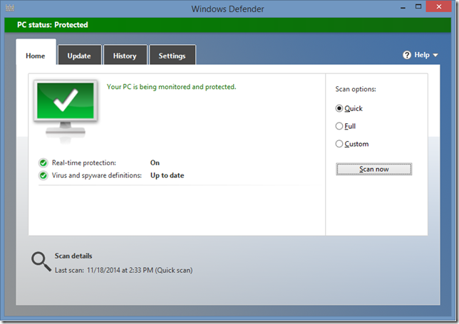
  2. just start typing “Defender” and you’ll see the “Windows Defender” appear.  Tap or Click on it to drop into the desktop and you’ll see this window:

 Windows Defender

This is what a healthy PC looks like.  If your PC is unhealthy, it’ll tell you on screen what you should do.  Which is most likely download the most recent updates, and then scan your PC.  It’ll quarantine/delete any files it detects that are a virus.  Easy Huh?  You don’t need any other Anti-virus program, as Windows Defender does it all.  If someone says you need something like McAfee, Symantec, or a paid Antivirus solution, you don’t.  Those applications provide additional security, but the base prevention of viruses is included with Windows 8.

IMPORTANT WINDOWS 7 NOTE: if you’re on Windows 7, then Windows Defender doesn’t do anti-virus, you’ll need to get Microsoft Security Essentials, which is a free download. Same comment on the other antivirus solutions, they aren’t necessary and cost money for features you most likely won’t use.

Step 2 – What the heck is running on that PC of yours?

Computers only have so much memory, probably barely any if you bought your computer for under $1000, and you want to keep the programs running down to the ones you need not the ones that have just decided you need them.  While there is probably a number of things running on your computer at this very moment, what you want to prevent is things from starting that you won’t use.  Here is how

  1. Let’s crack open the Task Manager, the fast keys are CTRL+SHIFT+ESC, or you can right-click on the task bar in the desktop and choose Task Manager.
  2. Flip over to the Startup tab.  Here is what you see:

Task Manager

As you can see, I have a pretty short list.  I’ve disabled what I don’t use EVERY time I reboot my computer.  Chrome, my browser does a tone of things for me, so I allow it to load in the background, I obviously want sound, so I leave my Realtek device enabled.  I print, so I leave the HP one enabled, but I use iTunes or my life experience camera, or send to one note, or Spotify only sometimes, or not at all.  I want to load those manually if I need them, so they are disabled.  Disabling things that are of high startup impact will make your computer boot faster.

Next, let’s trim some fat.  Out with the programs you don’t need!

  1. Hit the Start page up again with the start key, or the swipe for the charms, and then the start button
  2. On the start page, type in the word control, and you’ll see the Control Panel come up
  3. Launch that by taping or clicking on it, and you’ll end up in the Control Panel on the desktop
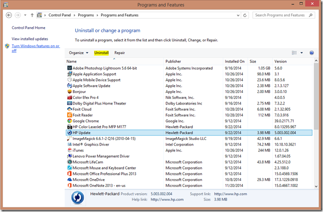
  4. Under Programs, click the Uninstall a program link, it should look like this:

 Control Panel - Programs and Features

This is where the fun begins, you want to go through program by program, and uninstall the ones you don’t use using the highlighted Un-install button.  You’ll find that some have unnecessarily hard un-install programs, these are probably the bloatware programs you’re loathing.  I often do a Google Search for “How to Uninstall %insert program name%” and then see what the internet says.  Ultimately you want to un-install anything that you’re not using. After this step you’ll likely have to reboot your computer, when it comes up, it’ll probably already be running faster.

This next step is not for the layman.  In fact, you can SERIOUSLY mess up your computer in this step, so skip it if you don’t feel comfortable, or better yet, take a screenshot and send it to someone you trust (yes family, you can send it to me).

Let’s get into the registry

  1. On the start menu type in RegEdit or press WIN+R and type Regedit.
  2. Agree to the access prompt allowing the app to open
  3. we’re going to need to navigate to two places here to see what’s else is loading
    • HKEY_CURRENT_USER\Software\Microsoft\Windows\CurrentVersion\Run
    • HKEY_LOCAL_MACHINE\SOFTWARE\Microsoft\Windows\CurrentVersion\Run

You’ll want to take a screenshot of each of these locations and send them to your trusted advisor.  Here is what the second one looks like for me:

Registry Editor

You will see a similar list (probably more technical) to the Task Manager above.  If you do wish to edit this.  You delete the ones you don’t want BUT BUT BUT!!!! make sure you export the key first as a backup, and know which ones you’re deleting and why.  The above are actually my audio drivers, so I want them to run, but they look uber geeky right?  So be careful here!

Step 3 – Browser Extensions

Many of the “Help I have a Virus!” emails I get always have screenshots of browsers, and said browser is saying stuff like “you’re internet is slow, you have a virus, run this program!”.  Please please please don’t run this program.  Anything windows *should* run, is already running for you.  My friends at Microsoft have done this for you. They don’t tell you what you should run, it’s just running!  So don’t run anything, or pay any money to run something.  A browser should open take you to your home page, and let you get on the Internet.  The browser isn’t going to tell you about the health of your computer, or want to collect money from you.  Let’s look at two browsers

Chrome

Let’s find the browser extensions and remove what we don’t need, unless you just installed it, then there aren’t any to worry about.

  1. Open Chrome and click on the three lines in the top right hand corner of the window
  2. click on Settings, then on the left hand side, click on Extensions.

You’re presented with a list of all the extensions.  Go through one by one and hit the trashcan to delete any you don’t use.  If you aren’t sure what one does, uncheck the Enable, and then close Chrome and open it and see if there are any differences. If there aren’t, chances are you want to delete that one anyways, so go back and delete it.

Internet Explorer

Let’s get killin’ extensions

  1. Click on the gear icon in the upper right of the browser window (under the “X” to close IE)
  2. Click on Manage Add-ons and you’ll see this:

IE Manage Add-ons

Now go through all the Toolbars and Extensions, and disable the ones you don’t use.  Also check out the Accelerators and remove the ones you don’t use as well.

When you’re done these, close the browser and re-open it. 

Step 4 – Getting more insight

Last but not least, I wanted to tell you a tool that gives you more insight on the stability/reliability of your computer.  It tells you when you did things, like install apps that cause problems.  It’s the Reliability Monitor.  Let’s open it up

  1. Get to the start page (press the start key, or use the start button on the charm fly-out)
  2. Type in the word Reliability, and select the Reliability Monitor.   You’ll end up back in the desktop seeing this page:

Reliability Monitor

You can click on each yellow warning triangle, or blue informational icon and see what happened on that day. The blue bar (across the very top of the graph at #10 for me) is your reliability monitor.  That bar may not be at the top for you, but you can follow that bar back in time to see when it dropped from a 10/10 score to a lower one, and you can see the event that took place.  My guess it’s the one day that you decided to install something because you were in a rush, and you picked a bad program.  It gives you more insight to what’s going on with your computer, and what the history was and why things are probably broken.

Anyways, if you’re a family member, and ask me to connect into your computer to fix your virus. These are the steps that I’m going to follow, so now you can too!

On a last note, I’m always told “oh, aren’t you going to defrag my hard drive?”.  Defragging is so 2008… with Windows 8 this happens automatically for you, but you can validate it’s enabled simply by

  1. Going to the start page
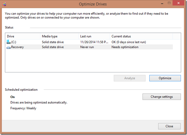
  2. Typing in defrag, and selecting the Defragment and Optimize your drives

Optimize Drives

Just click the Optimize button, or see when it was last run.  Note that the older “hard drives” need defragmenting, and the newer and faster SSDs need trimming.  Totally different technology, but Windows will handle both for you.

Good luck with your “virus”… and stop installing programs that you don’t need with bloatware!

Sunday, November 23, 2014

Ch-Ch-Ch-Changes …

Old Blog StyleI started this blog back in 2003.  I remember clearly asking permission to start an official “Small Business Server” blog to get information out to our community and my lead when I worked on the Small Business Server team thought it would take too much of my time.  I disagreed and started this blog anyways.  A lot has changed since then.
Many editions of Small Business Server and Home Server have shipped since that day, and the information on doing custom configuration to your server has grown on this site.  It’s not going anywhere, that’s not what this post is about.  It’s about the future!

After my SBS/WHS time was over, I decided to go work on Pinpoint (which has finally received some much needed updates thanks to some great friends and past co-workers!), but it was at this point in my career that I also decided to work remotely from Victoria, BC.  Working remotely has it’s pros and cons, one of the cons is that you don’t have much say what you work on.  As a result, I bounced around the Commerce Division, after Pinpoint was merged into it.  I learned a lot, met some awesome people, but got away from what inspired me about building software.  Getting to know my customer, getting to see UI and great experiences come to life and delight an end user.  Time for a change.

As of this summer I work for MetaLab, we build interfaces.  Actually, what we do is build a LOT of things.  We build iOS apps, from the ground up, we build robust services, we build websites, and most of all, we do it directly for customers.  We think about UI, we stress the P3 fit and finish bugs, and we design cool stuff that delights the end user.

Which brings me back to my blog.  The design needed a face lift to make it more interesting.  I wanted to talk weave technology and my creative side a little more.  All these photos you see on this blog are ones that I’ve taken, and ones that I’m proud of. So you’ll continue to see photos on here, you’ll continue to see the same old content on here, and you’ll still see new technical content, but the scope is larger.  I have my first MacBook now, I’m using Google Apps now, I use Slack.

Times are changin’… my theme is different, my posting scope is broader…

Thursday, October 16, 2014

Quickly Archiving Mail with Outlook 2013 when using Outlook.com

Third post in a series of posts on how to single-click (or swipe/tap) to Archive mail when using Outlook.com.  The first covered how to swipe-tap to archive in iOS 8, and the second covered on how to set up an Instant Action to mouse over and click to Archive a mail on the web client. 

This post covers the most famous email client of them all: Outlook.  And most specifically Outlook 2013.  As mentioned in the first post, the pre-setup for this one is to create a folder called Archive in your mailbox. I covered how to do this this in the iOS8 post.

With Outlook 2013, there is a Quick Steps box.  You’ve probably never noticed it, it’s at the top, on the ribbon.  Well, it’s a set of customizable actions, where the Outlook team has taken the liberty of defining ones for you, mostly destined for business.  If this is the first time you’ve used these, take a look around, they are really powerful. Even on a personal account.  For example, I have one called “To Wife” which just forwards the email to my wife.  I do this a lot when I get an email on something that she should know, but I digress.  Here is what my personal account looks like:

Quick Steps

Here’s how to set up the Archive one Quick Step

  1. Click on the Create New button in the Quick Steps box (you may have to scroll down using the arrows to see it), it’s depicted above.
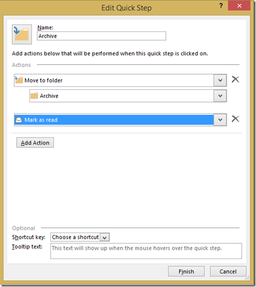
  2. Fill out the Quick Step, with your Name, and any number of actions you want to happen, it’s like a mail macro!  This is how mine is set up.  You can also assign a short cut key if you’re a keyboard kowboy. Edit Quick Step
  3. Click on Finish.

You’re Quick Step is ready to use.  Simply select the email you want to Archive and hit the new Archive Quick Step button, and the mail gets marked as read, and placed into your Archive folder.

Related Posts

Quickly Archiving Mail from the Outlook.com Web Client

In a previous post, I talked about how to quickly archive email in Outlook.com from the iOS 8 mail client. Similar to what you do with GMail, but of course we all don’t do our mail on our phones, we use computers as well! 
In this post I’ll tell you how to configure an Instant Action to do the same thing.  If you haven’t followed that post, then you are missing the pre-step to this one, which is to create a new folder called “Archive” (the name is key for iOS, not for the web client).  So do that first, then jump into these steps!
  1. First, log into your Outlook.com email account
  2. Click on the Settings gear (Settings Gear) in the top right hand corner of the page and select Options.
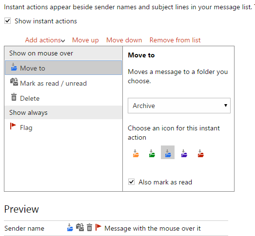
  3. On the Options page, under Customizing Outlook.com, you want to click on Instant Actions, in which you should see this Instant Actions
  4. Click on Add actions and then select Move To, and you’ll notice a Move To item show up in the list “Show on mouse over”
  5. In the right hand pane, choose to move a message to the “Archive” folder that you created, give it a coloured icon, and you can also choose to mark it as read if you want.  You can see how i might look in the preview (and how my preview looks above).  If you don’t like it the ordering, you can use Move Up and Move Down to order the list how you want.
That’s all there is to it.  Now when you mouse over the message in the message list, you get the Instant Actions to appear, and the Archiving icon you just created will single click it to the right folder.  Here is what mine looks like on the web:
Move this Message to Archive and mark it as read
Related Posts

Wednesday, October 15, 2014

Quickly Archiving Mail in iOS8 when using Outlook.com

One of my frustrations with Outlook.com, which isn’t configurable is how long it keeps deleted items for: 2 weeks.  That’s it.  2 weeks.  I for one want to have more time than 2 weeks to decide if I have to recover something from my deleted items.  And Outlook.com boasts unlimited storage now, or at least a lot of storage, to compete… so why not Archive email instead of delete it?
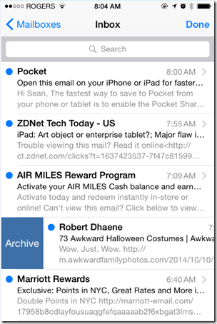
My workflow has changed.  Mail from computers, like Air Miles, or ZDNet or Marriott Rewards, after I’ve digested them, the deleted items is a perfect place for them.  But email from friends, family, co-workers, or even receipts and orders that I’ve done.  That mail just gets archived.. searchable.  The challenge I’ve been having is it’s hard to archive email, versus delete it.  I mean every app gives you a delete button, but not all apps give you archive, especially if you aren’t using GMail.
So, here is what I discovered on iOS 8 in order to Archive email on Outlook.com.
  1. Create a folder in your Outlook.com email address called “Archive”, this folder name is important, because iOS8 recognizes it.  In fact, now if you look at your folder list, it will look something like this.  Note the icon next to your Archive folder: Archive Folder Icon
  2. Now that iOS has recognized you have a folder to Archive email to, let’s make it super easy to add mail to it.  While you could just move mail to this folder like any other folder, iOS8 has a “swipe right” in the mail list that you can customize!  So to do that go into Settings, then Mail, Contacts, Calendars, and then Swipe Options.  From here you can simply click on Swipe Right, and choose the action of Archive, thus enabling you to swipe right and Archive that particular message or conversation grouping, and you're ready!: Change Swipe Right to Archive
That’s all there is to it.  Now when you are in your email message list, and you swipe right, you can simply Archive the message into the folder you created.  Check it out:
Swipe and Archive
Related Posts

Thursday, March 20, 2014

Efficiently Using Multiple Browsers (with a single key press)

Maybe I’m weird, or maybe my job has more requirements than others, but I use Google Chrome, and Microsoft Internet Explorer interchangeably.  I know web developers have this problem, perhaps they’ve already worked out a work flow, but I wasn’t able to find one.  Ultimately for things that are work related, I want to open those in Internet Explorer, and personal browsing, I want to use Google Chrome.  While we all have our reasons for using one browser over another (I have mine), if you want to use both, there was no really good way…

So I had a friend teach me how to write my own browser

Ok, ok, I didn’t technically write my own browser, that would take a lot of work, but what I did do is build a Browser Proxy.  The Browser Proxy is the default Browser on my PC, and all it does, is validate if a key is pressed (“Left Shift” to be exact) and either launch IE or Chrome based on that key.  This means for me now, “Click” is to open in IE and “Shift+Click” is to open in Chrome!

Here’s how I did it
First, you need AutoHotKey, which I’ve written about before.  You can use it have an always-on scripting engine running to help you control Windows, or to create scripts and turn them in executable, which is what we’re going to do here.  So get that installed on your PC.
Second, Choose your actual “Default Browser” in Windows.  I made Internet Explorer default because people send me work related links in Lync, Email, and they are scattered all through documents and such, so it makes sense to make IE default for me.  This means that without the SHIFT key down, IE will be used.
Third, we need to create what I call “Browser Proxy” executable, This is going to be a bit more complicated, to get you started, My friend and I have created the browser .ahk file (AutoHotKey script) and installer .reg file (think of this as associations for your application so Windows can find it).  Download the package here, (virus scan it, because you should virus scan any weird .zip file you download from the Internet), and then unzip it.  You’ll find 3 files, one of which is a readme and you can figure that out.
Crack open the BrowserProxy.ahk in Notepad or your favorite editor, it looks like this:
GetKeyState,State,LShift
IfEqual,State,U
{
    ; Shift Key up -- launch IE
    Run,"C:\Program Files (x86)\Internet Explorer\iexplore.exe" -nohome "%1%"
}
Else
{
    ; Shift Key down -- launch Chrome
    Run,"C:\Program Files (x86)\Google\Chrome\Application\chrome.exe" "%1%"
}
Validate the paths for both Internet Explorer and Chrome. Change the paths as appropriate.  You can also chose to use a different key, like if you wanted the Left CONTROL button to be the key you use, change the “LShift” in bold above to “LControl”.  In fact you can choose whatever key you want (here is the list).
Once you’ve got the script validated, save it and then since you now have AutoHotKey installed, you right click on the script and choose Compile Script.
Compile Script
This produces a BrowserProxy.exe in the same directory. I copied this to "C:\Program Files (x86)\BrowserProxy\BrowserProxy.exe" (and agreed to the UAC prompt). You can put this anywhere, but more updates will be required in the .reg file which we’re going to use next.
Now we need to import the BrowserProxy.reg file into your system registry.  Please do feel free to open it in Notepad before importing it (you should always be aware of what you’re putting into your registry), but it does 3 important things
  1. Define the BrowserProxy.exe application under the SOFTWARE section of the registry
  2. Registers that application
  3. Sets up the root classes that the application can handle
If you changed the path of where you put BrowserProxy.exe, you’ll need to update that as well, and mind that you keep double \\ when you put the path in.
Now that your own “Browser” is ready, you need to make it default.  This is how I did it on Windows 8.1
  1. Open the Desktop Control panel (Win+R, type “control”, and click OK)
  2. Click on Programs
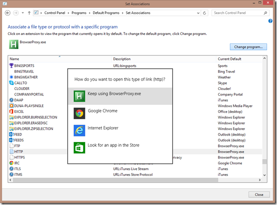
  3. select under Default Programs click on Make a file type always open a specific program.
  4. In this dialog, we need to change the default to “Browser Proxy” for “.htm”, “.html”, “.shtml”, “.xht”, “.xhtml”, “FTP”, “HTTP” and “HTTPS”.  Select the item in the list and click on Change program… then select BrowserProxy.exeChange Associations
Once you have configured all 8 defaults, you should be able to immediately start using a CLICK to open in IE and SHIFT+CLICK to open in Chrome!!
Note: Some applications may cache the default browser, in which case they would need to be restarted (My offender: Outlook).  Now you can use two browsers easily without having to do the usual tricks of copying URLs between browser windows, or manually setting default browsers constantly.
Final note: If you are looking for a way to launch Firefox, try changing the launch EXE in the .ahk script to:
{
    ; Shift Key down -- launch FireFox
    Run,"C:\Program Files (x86)\Mozilla Firefox\firefox.exe" -requestPending -osint -url "%1%"
}
For Reference here is the contents of the .reg file:
Windows Registry Editor Version 5.00
[HKEY_LOCAL_MACHINE\SOFTWARE\Clients\StartMenuInternet\BrowserProxy.EXE]
@="BrowserProxy"

[HKEY_LOCAL_MACHINE\SOFTWARE\Clients\StartMenuInternet\BrowserProxy.EXE\Capabilities]
"ApplicationDescription"="Browser Proxy Application, enables you to switch between IE or Chrome simply by pressing SHIFT when you click"
"ApplicationName"="BrowserProxy"

[HKEY_LOCAL_MACHINE\SOFTWARE\Clients\StartMenuInternet\BrowserProxy.EXE\Capabilities\FileAssociations]
".htm"="BrowserProxyHTML"
".html"="BrowserProxyHTML"
".shtml"="BrowserProxyHTML"
".xht"="BrowserProxyHTML"
".xhtml"="BrowserProxyHTML"

[HKEY_LOCAL_MACHINE\SOFTWARE\Clients\StartMenuInternet\BrowserProxy.EXE\Capabilities\StartMenu]
"StartMenuInternet"="BrowserProxy.EXE"

[HKEY_LOCAL_MACHINE\SOFTWARE\Clients\StartMenuInternet\BrowserProxy.EXE\Capabilities\URLAssociations]
"ftp"="BrowserProxyHTML"
"http"="BrowserProxyHTML"
"https"="BrowserProxyHTML"

[HKEY_LOCAL_MACHINE\SOFTWARE\Clients\StartMenuInternet\BrowserProxy.EXE\DefaultIcon]
@="C:\\Program Files (x86)\\BrowserProxy\\BrowserProxy.exe,0"

[HKEY_LOCAL_MACHINE\SOFTWARE\Clients\StartMenuInternet\BrowserProxy.EXE\shell]
[HKEY_LOCAL_MACHINE\SOFTWARE\Clients\StartMenuInternet\BrowserProxy.EXE\shell\open]
[HKEY_LOCAL_MACHINE\SOFTWARE\Clients\StartMenuInternet\BrowserProxy.EXE\shell\open\command]
@="\"C:\\Program Files (x86)\\BrowserProxy\\BrowserProxy.exe\""

[HKEY_LOCAL_MACHINE\SOFTWARE\RegisteredApplications]
"BrowserProxy"="Software\\Clients\\StartMenuInternet\\BrowserProxy.EXE\\Capabilities"

[HKEY_CLASSES_ROOT\BrowserProxyHTML]
@="Browser Proxy"
"FriendlyTypeName"="Browser Proxy"

[HKEY_CLASSES_ROOT\BrowserProxyHTML\DefaultIcon]
@="\"C:\\Program Files (x86)\\BrowserProxy\\BrowserProxy.exe\",0"

[HKEY_CLASSES_ROOT\BrowserProxyHTML\shell]
[HKEY_CLASSES_ROOT\BrowserProxyHTML\shell\open]
[HKEY_CLASSES_ROOT\BrowserProxyHTML\shell\open\command]
@="\"C:\\Program Files (x86)\\BrowserProxy\\BrowserProxy.exe\" \"%1\""

Monday, February 24, 2014

How to map your FourSquare data

I use FourSquare, not for the mayor-ships, or the points (although they are fun) but as a bit of history in my travels.  It’s easier to check in somewhere, then write it down the location and map it later.  My goal has always been to get some form of map with push pins in it.  Sure FourSquare provides a bit of history, but the map is SUPER tiny, and very hard to use

FourSquare activity - actual size

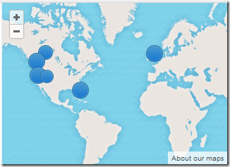
I’ve tried a bunch of solutions, usually provided by LifeHacker (one of my favourite websites), and they’ve all been just ok.  I think I’ve finally found a solution, that based on my check-in frequency, works for me.  LifeHacker posted a link to Billy Burle’s blog (follow BillyBurle here).  Billy had a blog post on How to Create a Heat Map of your FourSquare check-ins using Google Fusion Tables.  It’s quite frankly, awesome, but needed some adjustments.  I can get push-pins, or heat maps with this approach!  For example, here is my push-pin history for 2013:

Pushpin history

Or a Heat map of my travels to Seattle

Heat Map

Are you a map geek and want to do this?  So here is how…

Step 1: Obtain your check-in history from FourSquare

First you need to get your FourSquare check in history.  For this I browsed to my FourSquare Feeds, and got the URL for my KML feed.  It has a unique character set in it, because that’s your private feed.

Clicking the link will give you the last 50 or so check-ins.  what I did was right click on the link and say “Copy” url, pasted it into the address bar, then at the end of the URL I added the text “?count=1000” to get the last 1000 items (1000 is a key number in a lower step).  This will download a .kml file with the file name patching that crazy string character set in the URL.  I renamed mine to “Foursquare Data 2013”, just to make it easier to find.  Since I stored the .kml files for use if a better solution comes up down the road.

Step 2: Prepare the KML file to have only the years data

It’s pretty unlikely that you checked in exactly 1000 times in a given year, but in Step 1 we downloaded exactly 1000 historical check-ins.  So let’s make that exactly the year.  What I did (and I’m trying to figure out how to automated some of this) is to open the .kml file I downloaded in Notepad (I also turned on “word wrap”, since the file is one line, that’s 1000s of characters long).  I searched for “31 Dec” (or “30 Dec” or the last day you checked in on the previous year).  Then I scanned backwards in the file from that last check-in from the previous year until I found the “</Placemark><Placemark>”.  This is the end of the first check in of the current year, and the start of the last check in of the previous year.  I put my cursor between “><” characters and scrolled to the bottom of the document.  I then held shift and clicked between the “><” of the “</Placemark></Folder>”.  I then hit delete.  The end of the file should still look like “</Placemark></Folder></kml>”, but now everthing from the beginning of the document to the end of the document is exactly the current year you wish to display. 

The reason you need to do this, is because the Fusion Tables (at least as far as I can tell) have a hard coded limit of 1000 objects in them. So by limiting it to the year, I noticed in 2013, I had 783 check-ins, which is well under the 1000 limit.  But if I included 2010-2014 (my entire life of FourSquare check ins (obtained by adding to the URL: ?Count=10000”), I had 1723 check ins, and I was missing a bunch of data, hence my decision to break it up by year.  You may have to break it up further if you’re a FourSquare fanatic.

Step 3: Prepare Google Drive if you haven’t already

This was my first time using Google Drive, and as such, this is a one-time step I did for each year I imported.  I have OneDrive, where most of my online data is stored and I have a Home Server where my local data is stored, so I haven’t needed it. So I logged into my Google Drive account, and needed to add Fusion tables.  I clicked the down arrow on the settings gear ( Gear) and chose Manage Apps, then clicked on Connect more apps in the pop-up window.  In the search box I typed “fusion table”, and it was the only one I could install.  I installed it.  At the time of writing it is an experimental app…. which I figure is just typical of Google.  Is anything ever really out of Beta with them? ;o)

Step 4: Importing the data into a Fusion Table

This is where Billy Burle’s blog post really shines (I had to figure out all the above), and even helped in the comment section of Billy’s post with the data.  So here is the fun part

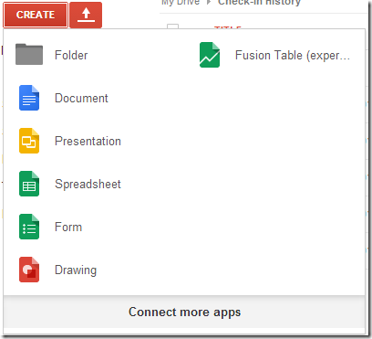
  1. Click on the Create Button
  2. Choose to create a new Fusion Table (experimental) Create / Fusion Table
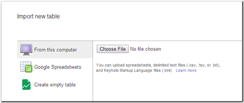
  3. Choose to upload a file from your computer by clicking Choose File and select the file that you created and edited in step 1 and 2, then click Next Choose File
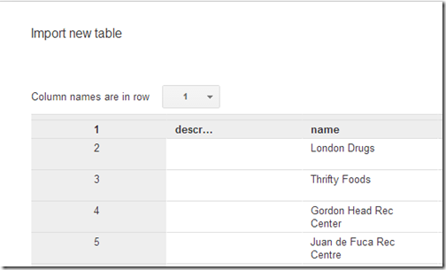
  4. On the import new table row, I just click Next again and leave the columns as is Column Headers
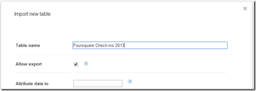
  5. On the final page, I give it a good friendly Table Name, and click Finish Import Finish

That’s it, now you have a new Fusion table.  Ready to see your check-in history?  Check out the Map of Geometry page, and now you can play around with the map, and choose the Feature Map (default) which is the push-pin view, or the Heatmap view:

Map of Geometry

Last but not least, if you ever want to revisit your data, just hit up your Google Drive and select the fusion table and it’s all saved there for you for that year.  So you can quickly pull it up at a map-tastic party.  What’s also awesome, is if you have a Windows 8.1 tablet (Like a Surface 2) then you can also just get the Windows Google Drive Client, and show it there instantly.  Works like it does on the web!

Enjoy and have fun with your data!